Chapter 18 Section 18.4: The H-R Diagram
18.4 The H–R Diagram
Learning Objectives
By the end of this section, you will be able to:
- Identify the physical characteristics of stars that are used to create an H–R diagram, and describe how those characteristics vary among groups of stars
- Discuss the physical properties of most stars found at different locations on the H–R diagram, such as radius, and for main sequence stars, mass
In this chapter and Analyzing Starlight, we described some of the characteristics by which we might classify stars and how those are measured. These ideas are summarized in Table. We have also given an example of a relationship between two of these characteristics in the mass-luminosity relation. When the characteristics of large numbers of stars were measured at the beginning of the twentieth century, astronomers were able to begin a deeper search for patterns and relationships in these data.
To help understand what sorts of relationships might be found, let’s look briefly at a range of data about human beings. If you want to understand humans by comparing and contrasting their characteristics—without assuming any previous knowledge of these strange creatures—you could try to determine which characteristics lead you in a fruitful direction. For example, you might plot the heights of a large sample of humans against their weights (which is a measure of their mass). Such a plot is shown in Figure 1 and it has some interesting features. In the way we have chosen to present our data, height increases upward, whereas weight increases to the left. Notice that humans are not randomly distributed in the graph. Most points fall along a sequence that goes from the upper left to the lower right.
Height versus Weight.
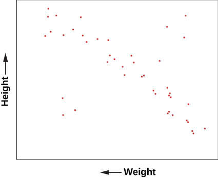
Figure 1. The plot of the heights and weights of a representative group of human beings. Most points lie along a “main sequence” representing most people, but there are a few exceptions.
We can conclude from this graph that human height and weight are related. Generally speaking, taller human beings weigh more, whereas shorter ones weigh less. This makes sense if you are familiar with the structure of human beings. Typically, if we have bigger bones, we have more flesh to fill out our larger frame. It’s not mathematically exact—there is a wide range of variation—but it’s not a bad overall rule. And, of course, there are some dramatic exceptions. You occasionally see a short human who is very overweight and would thus be more to the bottom left of our diagram than the average sequence of people. Or you might have a very tall, skinny fashion model with great height but relatively small weight, who would be found near the upper right.
A similar diagram has been found extremely useful for understanding the lives of stars. In 1913, American astronomer Henry Norris Russell plotted the luminosities of stars against their spectral classes (a way of denoting their surface temperatures). This investigation, and a similar independent study in 1911 by Danish astronomer Ejnar Hertzsprung, led to the extremely important discovery that the temperature and luminosity of stars are related (Figure 2).
Hertzsprung (1873–1967) and Russell (1877–1957).
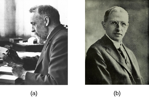
Figure 2. (a) Ejnar Hertzsprung and (b) Henry Norris Russell independently discovered the relationship between the luminosity and surface temperature of stars that is summarized in what is now called the H–R diagram.
HENRY NORRIS RUSSELL
When Henry Norris Russell graduated from Princeton University, his work had been so brilliant that the faculty decided to create a new level of honors degree beyond “summa cum laude” for him. His students later remembered him as a man whose thinking was three times faster than just about anybody else’s. His memory was so phenomenal, he could correctly quote an enormous number of poems and limericks, the entire Bible, tables of mathematical functions, and almost anything he had learned about astronomy. He was nervous, active, competitive, critical, and very articulate; he tended to dominate every meeting he attended. In outward appearance, he was an old-fashioned product of the nineteenth century who wore high-top black shoes and high starched collars, and carried an umbrella every day of his life. His 264 papers were enormously influential in many areas of astronomy.
Born in 1877, the son of a Presbyterian minister, Russell showed early promise. When he was 12, his family sent him to live with an aunt in Princeton so he could attend a top preparatory school. He lived in the same house in that town until his death in 1957 (interrupted only by a brief stay in Europe for graduate work). He was fond of recounting that both his mother and his maternal grandmother had won prizes in mathematics, and that he probably inherited his talents in that field from their side of the family.
Before Russell, American astronomers devoted themselves mainly to surveying the stars and making impressive catalogs of their properties, especially their spectra (as described in Analyzing Starlight). Russell began to see that interpreting the spectra of stars required a much more sophisticated understanding of the physics of the atom, a subject that was being developed by European physicists in the 1910s and 1920s. Russell embarked on a lifelong quest to ascertain the physical conditions inside stars from the clues in their spectra; his work inspired, and was continued by, a generation of astronomers, many trained by Russell and his collaborators.
Russell also made important contributions in the study of binary stars and the measurement of star masses, the origin of the solar system, the atmospheres of planets, and the measurement of distances in astronomy, among other fields. He was an influential teacher and popularizer of astronomy, writing a column on astronomical topics for Scientific American magazine for more than 40 years. He and two colleagues wrote a textbook for college astronomy classes that helped train astronomers and astronomy enthusiasts over several decades. That book set the scene for the kind of textbook you are now reading, which not only lays out the facts of astronomy but also explains how they fit together. Russell gave lectures around the country, often emphasizing the importance of understanding modern physics in order to grasp what was happening in astronomy.
Harlow Shapley, director of the Harvard College Observatory, called Russell “the dean of American astronomers.” Russell was certainly regarded as the leader of the field for many years and was consulted on many astronomical problems by colleagues from around the world. Today, one of the highest recognitions that an astronomer can receive is an award from the American Astronomical Society called the Russell Prize, set up in his memory.
Features of the H–R Diagram
Following Hertzsprung and Russell, let us plot the temperature (or spectral class) of a selected group of nearby stars against their luminosity and see what we find (Figure 3). Such a plot is frequently called the Hertzsprung–Russell diagram, abbreviated H–R diagram. It is one of the most important and widely used diagrams in astronomy, with applications that extend far beyond the purposes for which it was originally developed more than a century ago.
H–R Diagram for a Selected Sample of Stars.
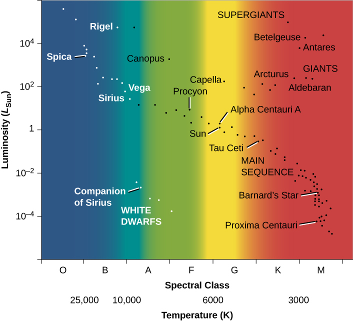
Figure 3. In such diagrams, luminosity is plotted along the vertical axis. Along the horizontal axis, we can plot either temperature or spectral type (also sometimes called spectral class). Several of the brightest stars are identified by name. Most stars fall on the main sequence.
It is customary to plot H–R diagrams in such a way that temperature increases toward the left and luminosity toward the top. Notice the similarity to our plot of height and weight for people (Figure 1). Stars, like people, are not distributed over the diagram at random, as they would be if they exhibited all combinations of luminosity and temperature. Instead, we see that the stars cluster into certain parts of the H–R diagram. The great majority are aligned along a narrow sequence running from the upper left (hot, highly luminous) to the lower right (cool, less luminous). This band of points is called the main sequence. It represents a relationship between temperature and luminosity that is followed by most stars. We can summarize this relationship by saying that hotter stars are more luminous than cooler ones.
A number of stars, however, lie above the main sequence on the H–R diagram, in the upper-right region, where stars have low temperature and high luminosity. How can a star be at once cool, meaning each square meter on the star does not put out all that much energy, and yet very luminous? The only way is for the star to be enormous—to have so many square meters on its surface that the total energy output is still large. These stars must be giants or supergiants, the stars of huge diameter we discussed earlier.
There are also some stars in the lower-left corner of the diagram, which have high temperature and low luminosity. If they have high surface temperatures, each square meter on that star puts out a lot of energy. How then can the overall star be dim? It must be that it has a very small total surface area; such stars are known as white dwarfs (white because, at these high temperatures, the colors of the electromagnetic radiation that they emit blend together to make them look bluish-white). We will say more about these puzzling objects in a moment. Figure 4 is a schematic H–R diagram for a large sample of stars, drawn to make the different types more apparent.
Schematic H–R Diagram for Many Stars.
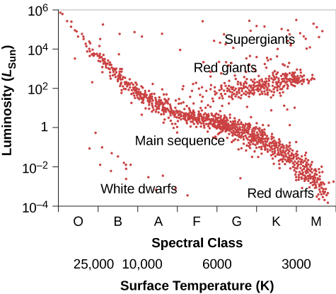
Figure 4. Ninety percent of all stars on such a diagram fall along a narrow band called the main sequence. A minority of stars are found in the upper right; they are both cool (and hence red) and bright, and must be giants. Some stars fall in the lower left of the diagram; they are both hot and dim, and must be white dwarfs.
Now, think back to our discussion of star surveys. It is difficult to plot an H–R diagram that is truly representative of all stars because most stars are so faint that we cannot see those outside our immediate neighborhood. The stars plotted in Figure 3 were selected because their distances are known. This sample omits many intrinsically faint stars that are nearby but have not had their distances measured, so it shows fewer faint main-sequence stars than a “fair” diagram would. To be truly representative of the stellar population, an H–R diagram should be plotted for all stars within a certain distance. Unfortunately, our knowledge is reasonably complete only for stars within 10 to 20 light-years of the Sun, among which there are no giants or supergiants. Still, from many surveys (and more can now be done with new, more powerful telescopes), we estimate that about 90% of the true stars overall (excluding brown dwarfs) in our part of space are main-sequence stars, about 10% are white dwarfs, and fewer than 1% are giants or supergiants.
These estimates can be used directly to understand the lives of stars. Permit us another quick analogy with people. Suppose we survey people just like astronomers survey stars, but we want to focus our attention on the location of young people, ages 6 to 18 years. Survey teams fan out and take data about where such youngsters are found at all times during a 24-hour day. Some are found in the local pizza parlor, others are asleep at home, some are at the movies, and many are in school. After surveying a very large number of young people, one of the things that the teams determine is that, averaged over the course of the 24 hours, one-third of all youngsters are found in school.
How can they interpret this result? Does it mean that two-thirds of students are truants and the remaining one-third spend all their time in school? No, we must bear in mind that the survey teams counted youngsters throughout the full 24-hour day. Some survey teams worked at night, when most youngsters were at home asleep, and others worked in the late afternoon, when most youngsters were on their way home from school (and more likely to be enjoying a pizza). If the survey was truly representative, we can conclude, however, that if an average of one-third of all youngsters are found in school, then humans ages 6 to 18 years must spend about one-third of their time in school.
We can do something similar for stars. We find that, on average, 90% of all stars are located on the main sequence of the H–R diagram. If we can identify some activity or life stage with the main sequence, then it follows that stars must spend 90% of their lives in that activity or life stage.
Understanding the Main Sequence
In The Sun: A Nuclear Powerhouse, we discussed the Sun as a representative star. We saw that what stars such as the Sun “do for a living” is to convert protons into helium deep in their interiors via the process of nuclear fusion, thus producing energy. The fusion of protons to helium is an excellent, long-lasting source of energy for a star because the bulk of every star consists of hydrogen atoms, whose nuclei are protons.
Our computer models of how stars evolve over time show us that a typical star will spend about 90% of its life fusing the abundant hydrogen in its core into helium. This then is a good explanation of why 90% of all stars are found on the main sequence in the H–R diagram. But if all the stars on the main sequence are doing the same thing (fusing hydrogen), why are they distributed along a sequence of points? That is, why do they differ in luminosity and surface temperature (which is what we are plotting on the H–R diagram)?
To help us understand how main-sequence stars differ, we can use one of the most important results from our studies of model stars. Astrophysicists have been able to show that the structure of stars that are in equilibrium and derive all their energy from nuclear fusion is completely and uniquely determined by just two quantities: the total mass and the composition of the star. This fact provides an interpretation of many features of the H–R diagram.
Imagine a cluster of stars forming from a cloud of interstellar “raw material” whose chemical composition is similar to the Sun’s. (We’ll describe this process in more detail in The Birth of Stars and Discovery of Planets outside the Solar System, but for now, the details will not concern us.) In such a cloud, all the clumps of gas and dust that become stars begin with the same chemical composition and differ from one another only in mass. Now suppose that we compute a model of each of these stars for the time at which it becomes stable and derives its energy from nuclear reactions, but before it has time to alter its composition appreciably as a result of these reactions.
The models calculated for these stars allow us to determine their luminosities, temperatures, and sizes. If we plot the results from the models—one point for each model star—on the H–R diagram, we get something that looks just like the main sequence we saw for real stars.
And here is what we find when we do this. The model stars with the largest masses are the hottest and most luminous, and they are located at the upper left of the diagram.
The least-massive model stars are the coolest and least luminous, and they are placed at the lower right of the plot. The other model stars all lie along a line running diagonally across the diagram. In other words, the main sequence turns out to be a sequence of stellar masses.
This makes sense if you think about it. The most massive stars have the most gravity and can thus compress their centers to the greatest degree. This means they are the hottest inside and the best at generating energy from nuclear reactions deep within. As a result, they shine with the greatest luminosity and have the hottest surface temperatures. The stars with lowest mass, in turn, are the coolest inside and least effective in generating energy. Thus, they are the least luminous and wind up being the coolest on the surface. Our Sun lies somewhere in the middle of these extremes (as you can see in Figure 3). The characteristics of representative main-sequence stars (excluding brown dwarfs, which are not true stars) are listed in Table.
Note that we’ve seen this 90% figure come up before. This is exactly what we found earlier when we examined the mass-luminosity relation (Figure 4). We observed that 90% of all stars seem to follow the relationship; these are the 90% of all stars that lie on the main sequence in our H–R diagram. Our models and our observations agree.
What about the other stars on the H–R diagram—the giants and supergiants, and the white dwarfs? As we will see in the next few chapters, these are what main-sequence stars turn into as they age: They are the later stages in a star’s life. As a star consumes its nuclear fuel, its source of energy changes, as do its chemical composition and interior structure. These changes cause the star to alter its luminosity and surface temperature so that it no longer lies on the main sequence on our diagram. Because stars spend much less time in these later stages of their lives, we see fewer stars in those regions of the H–R diagram.
Extremes of Stellar Luminosities, Diameters, and Densities
We can use the H–R diagram to explore the extremes in size, luminosity, and density found among the stars. Such extreme stars are not only interesting to fans of the Guinness Book of World Records; they can teach us a lot about how stars work. For example, we saw that the most massive main-sequence stars are the most luminous ones. We know of a few extreme stars that are a million times more luminous than the Sun, with masses that exceed 100 times the Sun’s mass. These superluminous stars, which are at the upper left of the H–R diagram, are exceedingly hot, very blue stars of spectral type O. These are the stars that would be the most conspicuous at vast distances in space.
The cool supergiants in the upper corner of the H–R diagram are as much as 10,000 times as luminous as the Sun. In addition, these stars have diameters very much larger than that of the Sun. As discussed above, some supergiants are so large that if the solar system could be centered in one, the star’s surface would lie beyond the orbit of Mars (see Figure 5). We will have to ask, in coming chapters, what process can make a star swell up to such an enormous size, and how long these “swollen” stars can last in their distended state.
The Sun and a Supergiant.
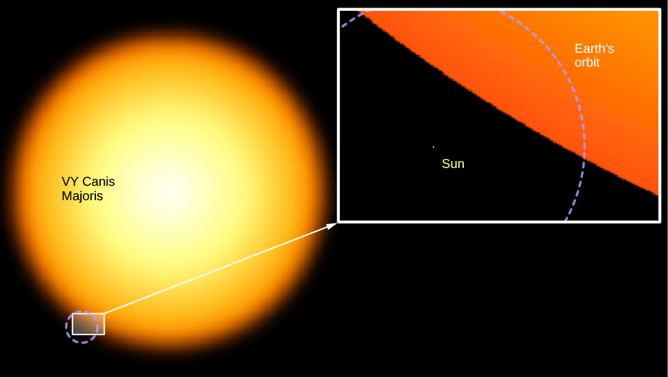
Figure 5. Here you see how small the Sun looks in comparison to one of the largest known stars: VY Canis Majoris, a supergiant.
In contrast, the very common red, cool, low-luminosity stars at the lower end of the main sequence are much smaller and more compact than the Sun. An example of such a red dwarf is Ross 614B, with a surface temperature of 2700 K and only 1/2000 of the Sun’s luminosity. We call such a star a dwarf because its diameter is only 1/10 that of the Sun. A star with such a low luminosity also has a low mass (about 1/12 that of the Sun). This combination of mass and diameter means that it is so compressed that the star has an average density about 80 times that of the Sun. Its density must be higher, in fact, than that of any known solid found on the surface of Earth. (Despite this, the star is made of gas throughout because its center is so hot.)
The faint, red, main-sequence stars are not the stars of the most extreme densities, however. The white dwarfs, at the lower-left corner of the H–R diagram, have densities many times greater still.
The White Dwarfs
The first white dwarf star was detected in 1862. Called Sirius B, it forms a binary system with Sirius A, the brightest-appearing star in the sky. It eluded discovery and analysis for a long time because its faint light tends to be lost in the glare of nearby Sirius A (Figure 6). (Since Sirius is often called the Dog Star—being the brightest star in the constellation of Canis Major, the big dog—Sirius B is sometimes nicknamed the Pup.)
Two Views of Sirius and Its White Dwarf Companion.
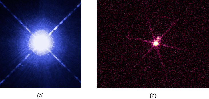
Figure 6. (a) The (visible light) image, taken with the Hubble Space Telescope, shows bright Sirius A, and, below it and off to its left, faint Sirius B. (b) This image of the Sirius star system was taken with the Chandra X-Ray Telescope. Now, the bright object is the white dwarf companion, Sirius B. Sirius A is the faint object above it; what we are seeing from Sirius is probably not actually X-ray radiation but rather ultraviolet light that has leaked into the detector. Note that the ultraviolet intensities of these two objects are completely reversed from the situation in visible light because Sirius B is hotter and emits more higher-frequency radiation. (credit a: modification of work by NASA, H.E. Bond and E. Nelan (Space Telescope Science Institute), M. Barstow and M. Burleigh (University of Leicester) and J.B. Holberg (University of Arizona); credit b: modification of work by NASA/SAO/CXC)
We have now found thousands of white dwarfs. This simulation shows that about 7% of the true stars (spectral types O–M) in our local neighborhood are white dwarfs. A good example of a typical white dwarf is the nearby star 40 Eridani B. Its surface temperature is a relatively hot 12,000 K, but its luminosity is only 1/275 LSun. Calculations show that its radius is only 1.4% of the Sun’s, or about the same as that of Earth, and its volume is 2.5 × 10⁻⁶ that of the Sun. Its mass, however, is 0.57 times the Sun’s mass, just a little more than half. To fit such a substantial mass into so tiny a volume, the star’s density must be about 210,000 times the density of the Sun, or more than 300,000 g/cm3. A teaspoonful of this material would have a mass of some 1.6 tons! At such enormous densities, matter cannot exist in its usual state; we will examine the particular behavior of this type of matter in The Death of Stars. For now, we just note that white dwarfs are dying stars, reaching the end of their productive lives and ready for their stories to be over.
The British astrophysicist (and science popularizer) Arthur Eddington (1882–1944) described the first known white dwarf this way:
The message of the companion of Sirius, when decoded, ran: “I am composed of material three thousand times denser than anything you’ve ever come across. A ton of my material would be a little nugget you could put in a matchbox.” What reply could one make to something like that? Well, the reply most of us made in 1914 was, “Shut up; don’t talk nonsense.”
Today, however, astronomers not only accept that stars as dense as white dwarfs exist but (as we will see) have found even denser and stranger objects in their quest to understand the evolution of different types of stars.
Key Concepts and Summary
The Hertzsprung–Russell diagram, or H–R diagram, is a plot of stellar luminosity against surface temperature. Most stars lie on the main sequence, which extends diagonally across the H–R diagram from high temperature and high luminosity to low temperature and low luminosity. The position of a star along the main sequence is determined by its mass. High-mass stars emit more energy and are hotter than low-mass stars on the main sequence. Main-sequence stars derive their energy from the fusion of protons to helium. About 90% of the stars lie on the main sequence. Only about 10% of the stars are white dwarfs, and fewer than 1% are giants or supergiants.
For Further Exploration
Articles
Croswell, K. “The Periodic Table of the Cosmos.” Scientific American (July 2011):45–49. A brief introduction to the history and uses of the H–R diagram.
Davis, J. “Measuring the Stars.” Sky & Telescope (October 1991): 361. The article explains direct measurements of stellar diameters.
DeVorkin, D. “Henry Norris Russell.” Scientific American (May 1989): 126.
Kaler, J. “Journeys on the H–R Diagram.” Sky & Telescope (May 1988): 483.
McAllister, H. “Twenty Years of Seeing Double.” Sky & Telescope (November 1996): 28. An update on modern studies of binary stars.
Parker, B. “Those Amazing White Dwarfs.” Astronomy (July 1984): 15. The article focuses on the history of their discovery.
Pasachoff, J. “The H–R Diagram’s 100th Anniversary.” Sky & Telescope (June 2014): 32.
Roth, J., and Sinnott, R. “Our Studies of Celestial Neighbors.” Sky & Telescope (October 1996): 32. A discussion is provided on finding the nearest stars.
Websites
Eclipsing Binary Stars: http://www.midnightkite.com/index.aspx?URL=Binary. Dan Bruton at Austin State University has created this collection of animations, articles, and links showing how astronomers use eclipsing binary light curves.
Henry Norris Russell: http://www.nasonline.org/publications/biographical-memoirs/memoir-pdfs/russell-henry-n.pdf. A biographic memoir by Harlow Shapley.
Hertzsprung–Russell Diagram: http://skyserver.sdss.org/dr1/en/proj/advanced/hr/. This site from the Sloan Digital Sky Survey introduces the H–R diagram and gives you information for making your own. You can go step by step by using the menu at the left. Note that in the project instructions, the word “here” is a link and takes you to the data you need.
Stars of the Week: http://stars.astro.illinois.edu/sow/sowlist.html. Astronomer James Kaler does “biographical summaries” of famous stars—not the Hollywood type, but ones in the real sky.
Videos
WISE Mission Surveys Nearby Stars: http://www.jpl.nasa.gov/video/details.php?id=1089. Short video about the WISE telescope survey of brown dwarfs and M dwarfs in our immediate neighborhood (1:21).
Collaborative Group Activities
- Two stars are seen close together in the sky, and your group is given the task of determining whether they are a visual binary or whether they just happen to be seen in nearly the same direction. You have access to a good observatory. Make a list of the types of measurements you would make to determine whether they orbit each other.
- Your group is given information about five main sequence stars that are among the brightest-appearing stars in the sky and yet are pretty far away. Where would these stars be on the H–R diagram and why? Next, your group is given information about five main-sequence stars that are typical of the stars closest to us. Where would these stars be on the H–R diagram and why?
- A very wealthy (but eccentric) alumnus of your college donates a lot of money for a fund that will help in the search for more brown dwarfs. Your group is the committee in charge of this fund. How would you spend the money? (Be as specific as you can, listing instruments and observing programs.)
- Use the internet to search for information about the stars with the largest known diameter. What star is considered the record holder (this changes as new measurements are made)? Read about some of the largest stars on the web. Can your group list some reasons why it might be hard to know which star is the largest?
- Use the internet to search for information about stars with the largest mass. What star is the current “mass champion” among stars? Try to research how the mass of one or more of the most massive stars was measured, and report to the group or the whole class.
Review Questions
How does the mass of the Sun compare with that of other stars in our local neighborhood?
Name and describe the three types of binary systems.
Describe two ways of determining the diameter of a star.
What are the largest- and smallest-known values of the mass, luminosity, surface temperature, and diameter of stars (roughly)?
You are able to take spectra of both stars in an eclipsing binary system. List all properties of the stars that can be measured from their spectra and light curves.
Sketch an H–R diagram. Label the axes. Show where cool supergiants, white dwarfs, the Sun, and main-sequence stars are found.
Describe what a typical star in the Galaxy would be like compared to the Sun.
How do we distinguish stars from brown dwarfs? How do we distinguish brown dwarfs from planets?
Describe how the mass, luminosity, surface temperature, and radius of main-sequence stars change in value going from the “bottom” to the “top” of the main sequence.
One method to measure the diameter of a star is to use an object like the Moon or a planet to block out its light and to measure the time it takes to cover up the object. Why is this method used more often with the Moon rather than the planets, even though there are more planets?
We discussed in the chapter that about half of stars come in pairs, or multiple star systems, yet the first eclipsing binary was not discovered until the eighteenth century. Why?
Thought Questions
Is the Sun an average star? Why or why not?
Suppose you want to determine the average educational level of people throughout the nation. Since it would be a great deal of work to survey every citizen, you decide to make your task easier by asking only the people on your campus. Will you get an accurate answer? Will your survey be distorted by a selection effect? Explain.
Why do most known visual binaries have relatively long periods and most spectroscopic binaries have relatively short periods?
This figure shows the light curve of a hypothetical eclipsing binary star in which the light of one star is completely blocked by another. What would the light curve look like for a system in which the light of the smaller star is only partially blocked by the larger one? Assume the smaller star is the hotter one. Sketch the relative positions of the two stars that correspond to various portions of the light curve.
There are fewer eclipsing binaries than spectroscopic binaries. Explain why.
Within 50 light-years of the Sun, visual binaries outnumber eclipsing binaries. Why?
Which is easier to observe at large distances—a spectroscopic binary or a visual binary?
The eclipsing binary Algol drops from maximum to minimum brightness in about 4 hours, remains at minimum brightness for 20 minutes, and then takes another 4 hours to return to maximum brightness. Assume that we view this system exactly edge-on, so that one star crosses directly in front of the other. Is one star much larger than the other, or are they fairly similar in size? (Hint: Refer to the diagrams of eclipsing binary light curves.)
Review this spectral data for five stars.
| Table A | |
|---|---|
| Star | Spectrum |
| 1 | G, main sequence |
| 2 | K, giant |
| 3 | K, main sequence |
| 4 | O, main sequence |
| 5 | M, main sequence |
Which is the hottest? Coolest? Most luminous? Least luminous? In each case, give your reasoning.
Which changes by the largest factor along the main sequence from spectral types O to M—mass or luminosity?
Suppose you want to search for brown dwarfs using a space telescope. Will you design your telescope to detect light in the ultraviolet or the infrared part of the spectrum? Why?
An astronomer discovers a type-M star with a large luminosity. How is this possible? What kind of star is it?
Approximately 6000 stars are bright enough to be seen without a telescope. Are any of these white dwarfs? Use the information given in this chapter to explain your reasoning.
Use the data in Appendix J to plot an H–R diagram for the brightest stars. Use the data from Table to show where the main sequence lies. Do 90% of the brightest stars lie on or near the main sequence? Explain why or why not.
Use the diagram you have drawn for the last question to answer the following questions: Which star is more massive—Sirius or Alpha Centauri? Rigel and Regulus have nearly the same spectral type. Which is larger? Rigel and Betelgeuse have nearly the same luminosity. Which is larger? Which is redder?
Use the data in Appendix I to plot an H–R diagram for this sample of nearby stars. How does this plot differ from the one for the brightest stars in the exercise before last? Why?
If a visual binary system were to have two equal-mass stars, how would they be located relative to the center of the mass of the system? What would you observe as you watched these stars as they orbited the center of mass, assuming very circular orbits, and assuming the orbit was face on to your view?
Two stars are in a visual binary star system that we see face on. One star is very massive whereas the other is much less massive. Assuming circular orbits, describe their relative orbits in terms of orbit size, period, and orbital velocity.
Describe the spectra for a spectroscopic binary for a system comprised of an F-type and L-type star. Assume that the system is too far away to be able to easily observe the L-type star.
This graph shows the velocity of two stars in a spectroscopic binary system. Which star is the most massive? Explain your reasoning.
You go out stargazing one night, and someone asks you how far away the brightest stars we see in the sky without a telescope are. What would be a good, general response? (Use Appendix J for more information.)
If you were to compare three stars with the same surface temperature, with one star being a giant, another a supergiant, and the third a main-sequence star, how would their radii compare to one another?
Are supergiant stars also extremely massive? Explain the reasoning behind your answer.
Consider the following data on four stars:
| Table B | ||
|---|---|---|
| Star | Luminosity (in LSun) | Type |
| 1 | 100 | B, main sequence |
| 2 | 1/100 | B, white dwarf |
| 3 | 1/100 | M, main sequence |
| 4 | 100 | M, giant |
Which star would have the largest radius? Which star would have the smallest radius? Which star is the most common in our area of the Galaxy? Which star is the least common?
Figuring for Yourself
If two stars are in a binary system with a combined mass of 5.5 solar masses and an orbital period of 12 years, what is the average distance between the two stars?
It is possible that stars as much as 200 times the Sun’s mass or more exist. What is the luminosity of such a star based upon the mass-luminosity relation?
The lowest mass for a true star is 1/12 the mass of the Sun. What is the luminosity of such a star based upon the mass-luminosity relationship?
Spectral types are an indicator of temperature. For the first 10 stars in Appendix J, the list of the brightest stars in our skies, estimate their temperatures from their spectral types. Use information in the figures and/or tables in this chapter and describe how you made the estimates.
We can estimate the masses of most of the stars in Appendix J from the mass-luminosity relationship in this figure. However, remember this relationship works only for main sequence stars. Determine which of the first 10 stars in Appendix J are main sequence stars. Use one of the figures in this chapter. Make a table of stars’ masses.
In Diameters of Stars, the relative diameters of the two stars in the Sirius system were determined. Let’s use this value to explore other aspects of this system. This will be done through several steps, each in its own exercise. Assume the temperature of the Sun is 5800 K, and the temperature of Sirius A, the larger star of the binary, is
10,000 K. The luminosity of Sirius A can be found in Appendix J, and is given as about 23 times that of the Sun. Using the values provided, calculate the radius of Sirius A relative to that of the Sun.
Now calculate the radius of Sirius’ white dwarf companion, Sirius B, to the Sun.
How does this radius of Sirius B compare with that of Earth?
From the previous calculations and the results from Diameters of Stars, it is possible to calculate the density of Sirius B relative to the Sun. It is worth noting that the radius of the companion is very similar to that of Earth, whereas the mass is very similar to the Sun’s. How does the companion’s density compare to that of the Sun? Recall that density = mass/volume, and the volume of a sphere = (4/3)πR3. How does this density compare with that of water and other materials discussed in this text? Can you see why astronomers were so surprised and puzzled when they first determined the orbit of the companion to Sirius?
How much would you weigh if you were suddenly transported to the white dwarf Sirius B? You may use your own weight (or if don’t want to own up to what it is, assume you weigh 70 kg or 150 lb). In this case, assume that the companion to Sirius has a mass equal to that of the Sun and a radius equal to that of Earth. Remember Newton’s law of gravity:

and that your weight is proportional to the force that you feel. What kind of star should you travel to if you want to lose weight (and not gain it)?
The star Betelgeuse has a temperature of 3400 K and a luminosity of 13,200 LSun. Calculate the radius of Betelgeuse relative to the Sun.
Using the information provided in this table, what is the average stellar density in our part of the Galaxy? Use only the true stars (types O–M) and assume a spherical distribution with radius of 26 light-years.
Confirm that the angular diameter of the Sun of 1/2° corresponds to a linear diameter of 1.39 million km. Use the average distance of the Sun and Earth to derive the answer. (Hint: This can be solved using a trigonometric function.)
An eclipsing binary star system is observed with the following contact times for the main eclipse:
| Table C | ||
|---|---|---|
| Contact | Time | Date |
| First contact | 12:00 p.m. | March 12 |
| Second contact | 4:00 p.m. | March 13 |
| Third contact | 9:00 a.m. | March 18 |
| Fourth contact | 1:00 p.m. | March 19 |
The orbital velocity of the smaller star relative to the larger is 62,000 km/h. Determine the diameters for each star in the system.
If a 100 solar mass star were to have a luminosity of 107 times the Sun’s luminosity, how would such a star’s density compare when it is on the main sequence as an O-type star, and when it is a cool supergiant (M-type)? Use values of temperature from Figure or Figure and the relationship between luminosity, radius, and temperature as given in the previous question asking the average stellar density in our part of the Galaxy.
If Betelgeuse had a mass that was 25 times that of the Sun, how would its average density compare to that of the Sun? Use the definition of  , where the volume is that of a sphere.
Glossary
- H–R diagram
- (Hertzsprung–Russell diagram) a plot of luminosity against surface temperature (or spectral type) for a group of stars
- main sequence
- a sequence of stars on the Hertzsprung–Russell diagram, containing the majority of stars, that runs diagonally from the upper left to the lower right
- white dwarf
- a low-mass star that has exhausted most or all of its nuclear fuel and has collapsed to a very small size; such a star is near its final state of life
